CATALIA HEALTH
A Responsive Health Portal
UCI MHCID Capstone Project

2018
ROLE: UX DESIGNER/RESEARCHER
Catalia Health is known for their Mabu personal healthcare companion. The face of Catalia Health’s patient engagement platform, Mabu helps patients with chronic disease management.
To extend Mabu’s capabilities for data input and to deliver increased interactivity to patients, we were asked to create a health portal that would allow patients to not only input their medications and health data points, but also track their progress over time.
ABOUT CATALIA HEALTH
Catalia Health is on a mission to address both sides of the healthcare equation: improving patients’ health and extending the capabilities and efficiency of healthcare companies.
They believe that to improve behavior you have to measure it—and keep measuring it over the long term. That’s why they made Mabu—because a platform should be easy to use, engaging, and tailored to each patient.
PROJECT BACKGROUND
We were asked to create a health portal as an extension to Mabu that would allow users to view all previous data tracked including: blood pressure, weight, medication, and symptoms. Additionally we were tasked to allow users to add and edit their medication alerts and needs, and to create a way for users to communicate with their healthcare providers.
USER RESEARCH
We did not have access to Mabu’s beta testers to identify what the Mabu experience was like and how we could improve upon the existing experience by addressing any current pain points with Mabu. Instead we utilized a combination of competitive analysis of health portals, existing research, and quantitative and qualitative user research on chronic health patients within the team’s social network.


DESIGN GOALS
Combining our findings of the user’s needs and the requirements set by Catalia Health, we came up with 2 design goals:
-
Allow the user to quickly and easily recognize the data and if there is a problem that needs to be addressed.
-
Track and view progress of metrics and compare them to the user’s goals.
IDEATION
My primary focus during the design phase was to develop the dashboard and details page in which the users would be able to view the 4 metrics Mabu recorded: blood pressure, weight, medication, and symptoms. During the early wireframing process and sketches, I explored different layout variations and graphics on how to display the metrics being measured.

DASHBOARD
To make each metric easy to scan and read, I utilized a mixture of icons, text and color. We started to experiment with overlays of the data visualized to help the users gauge their progress without entering the detailed view, but decided against it, as there was too much information to digest, which could lead to confusion or a slower scan by the user. With accessibility in mind, we utilized an icon, text, and color to help colorblind users quickly recognize the status of each metric.
Early iterations of the dashboard, exploring how data is displayed.
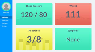


Web and mobile view of final Dashboard design.


DETAILS
The details page provides the user a history of the metrics and provides insight on their progress. Each module allows the user to filter their view by date, add/edit metrics, and print or email their history.
One design challenge was how to display the symptoms data set, as it was the only data set that did not use a numerical metric. For this challenge I referred to how the Mabu team and healthcare providers viewed the data, and combined it with a more common calendar view. This helped users easily recognize which month and day they were viewing.

RESULTS
During our design phase we only had enough time for one round of user testing, which resulted in a change in our terminology use and an additional use of an icon to help identify a metric’s status to help with accessibility. In the end we created a high fidelity prototype in which we identified and established a visual style and basic user flow of the main functions.

LEARNINGS
Moving forward with the product, we would further test it with actual Mabu users to see how we can further help improve the entire Mabu experience and how to help alleviate pain points. I would have liked to see how this product could evolve and eventually help real patients monitor their health.
Building this project with a team from beginning to end taught me a lot about working as a team remotely and the importance of communication. There were times where lack of communication caused the team to fall behind schedule and go in the wrong design direction. Despite a few setbacks this was a great project to work on, as I got to learn a lot from my experienced teammates. I found enjoyment in creating a product that helps people take charge of their overall health and well-being.